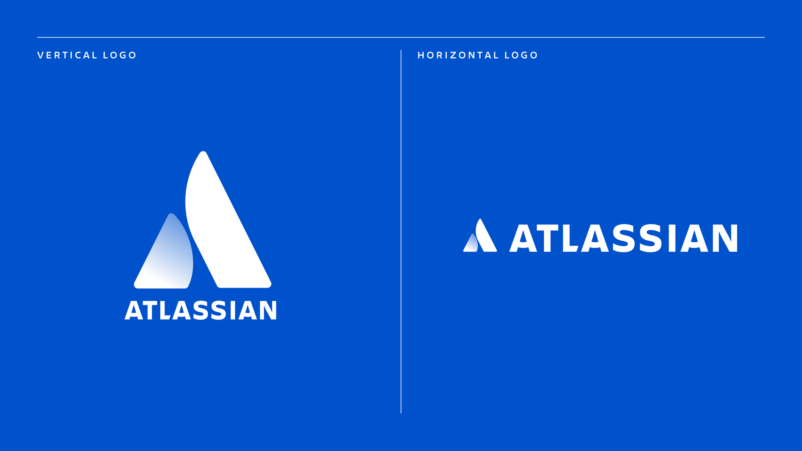
Atlassian has revealed a new logo, retiring the classic 'Atlas' logo after 15 years.
Co-founder and chief executive Mike Cannon-Brookes said the new logo reflected the software giant's focus on teamwork and open working. The new logo can be seen as two hands high-fiving, a mountain or the letter A, with each pillar reinforcing the other.
"At Atlassian, we think of our brand as a continuous project that’s never totally done. Just as people and companies evolve, so do brands," Cannon-Brookes wrote in a blog post.
"We’ve grown ours over many years through our fantastic products, a unique culture, and an incredible customer community. Today, we’re taking a bold step forward with a new logo and identity system for Atlassian and our products."
Cannon-Brookes created the original logo back when the company was founded it in 2002. The first logo was inspired by the Greek God Atlas, which he said represented Atlassian's service and support.
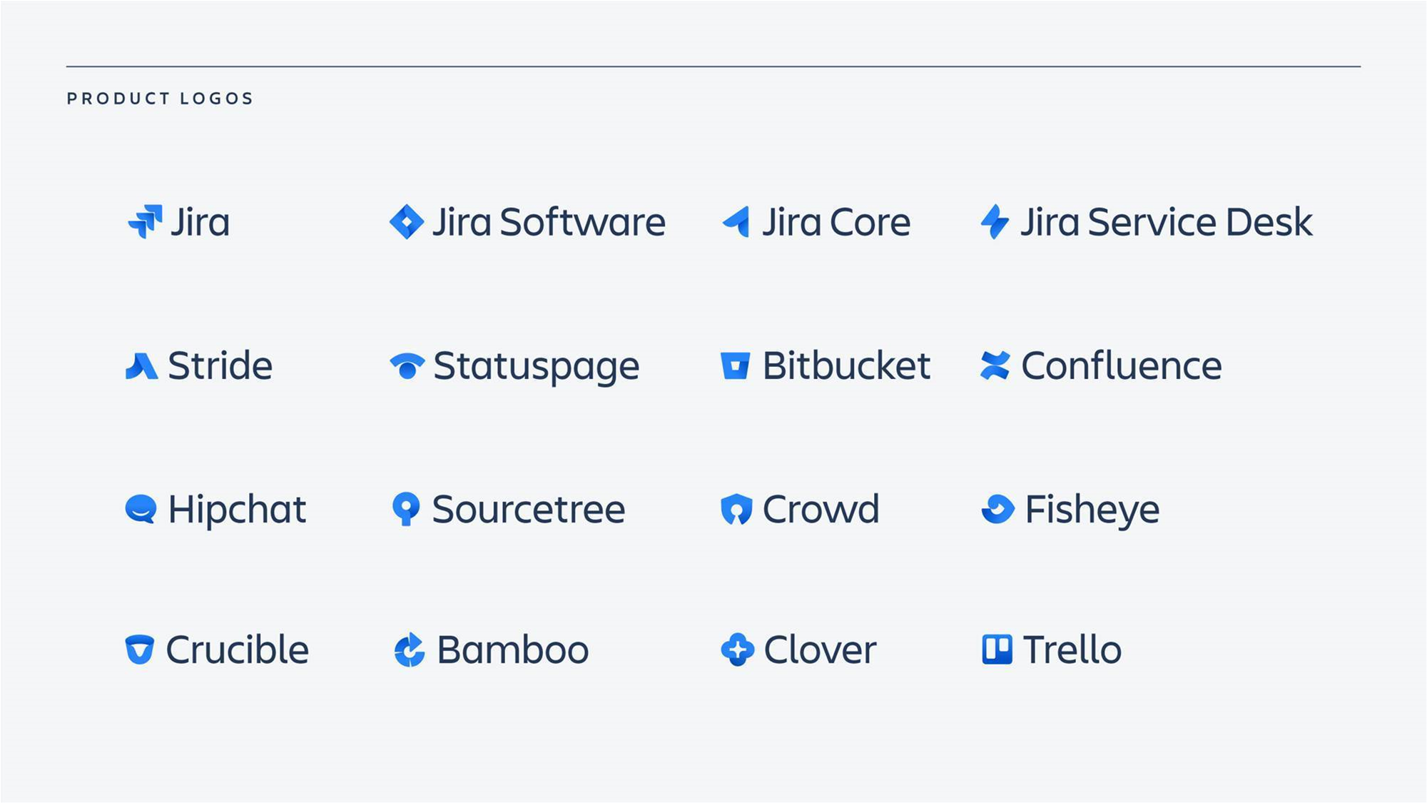
Atlassian has also changed the individual logos for each of its 16 products to match the new company logo. Cannon-Brookes said the product logos were designed to be flexible to make way for future products and acquisitions.
Atlassian was founded in 2002 by Cannon-Brookes and Scott Farquhar in Sydney, and has grown into a more than $8 billion software company with 1760 staff globally.


_(30).jpg&h=142&w=230&c=1&s=1)
_(25).jpg&h=142&w=230&c=1&s=1)


.jpg&w=100&c=1&s=0)


