Apple has said there are more than one billion iOS devices actually in use globally. That's about the same as all the Windows PCs in use, and it means an update to iOS is a major event.
Even the little things are significant, because they affect a billion people, so it makes sense to go with what works. The tried and tested. Why not let some other hapless mobile operating system developer take the risk first?
That's what Apple seems to have been doing for some time now, and iOS 10 is no different. Not for the first time, I found myself reading through the list of changes and new features and thinking: “Do you know what? I've seen this somewhere before.” But is this necessarily a bad thing? I don't think it is. In fact, I'm all for it, especially as Apple usually puts its own special spin on things.
So how about iOS 10? Well, there are plenty of things in this latest release to get stuck into, chew over and ruminate on the significance of. Most of them can be dropped in the “mmm, that's nice” bucket rather than the “wow that's going to change my life” one, but is it a dud or a work of genius? I've installed the beta on an iPad Pro and iPhone 6s to find out.
What it means for iPad users
The one thing the iPad desperately needed from this version of iOS was a big improvement in its split-screen, multitasking view.
This should not be rocket science.
After all, if Windows 10 can do it, why not the most-used mobile operating system on earth?
Yet still developers need to build in support for the feature explicitly, resulting in some apps that work perfectly while others don't work at all (hello, Google Docs!). And that's before I get started on its usability. Having to scroll through lists of icons to find the app you want to open in split-screen view – when it may not be on that list at all – is beyond irritating.
Apple has addressed none of these fundamental issues in iOS 10. Instead, we have split-screen Safari windows and side-docking 'reply' windows in Mail. Both of these features are useful in their own way; the latter particularly so, allowing you to refer to and browse your email while composing a message, without having to save a draft and exit first.
And it's beautifully elegant. Simply drag the message window over to the right-hand side using the title bar, whereupon the message list and preview panes shrink and dock to the left. But do we really need more different ways to do the same thing? Apple needs to develop a solution that works for all apps and all windows, before it gets out of hand and we have a hundred different apps all doing split view in their own way.
Of course, not everyone cares as much about multitasking as I do. In fact, those who don't own and use an iPad Pro every day will probably wonder what the fuss is all about. And then they'll take a look at the rest of the changes and realise there isn't much else to cheer about either.
Aside from the addition of a homescreen shortcut in the keyboard shortcut app switcher, there's little here for iPad users, which is a disappointment.

What it means for iPhone users
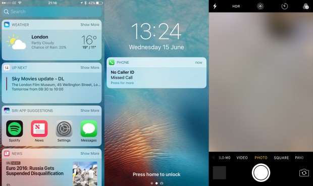
It's true that both iPad and iPhone users benefit from most of iOS 10's new UI features, such as the rich notifications and customisable lockscreen widgets, and the ability to access the camera more easily with a swipe from the right edge of the screen. But these sorts of improvements seem to have been added with the iPhone user front and centre.
Not that this is a bad thing. I use an iPhone a lot of the time, and I can see many of the new features coming in handy. I've long disliked the bare, rather dysfunctional lockscreen view of previous iterations of iOS, and the new card-based notifications are a significant step forward. They look nicer, are easier to read and let you do stuff without having to unlock your handset.
The new widgets, accessible with a swipe to the left, make the job of accessing key information quickly much easier, too, and I'm already loving the easier camera lockscreen access.
The one concern I have is that to make the most of the improvements to the lockscreen, I'm going to have to modify my behavior somewhat. Currently, every time I pick up my iPhone I unlock it straight away; in the future, I won't have to do that to check my notifications – I'll just need to pick it up.
Still, once you have unlocked the phone, there's plenty of other stuff to play around with. Pull down from the top of the display and you'll see the new-style notifications are here, too, with those widgets off to the left.
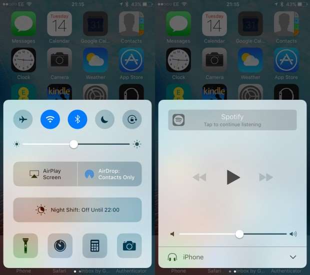
Pull up from the bottom of the screen and you'll see that the Control Centre has expanded: there are now two panels to swipe between instead of one. Your toggles, AirDrop and AirPlay options are on one panel, while the brightness slider and media controls are on the other. There's still no sign of a Settings shortcut, however, which is utterly maddening.
That's it for major UI changes, although it is worth mentioning the onscreen keyboard, which has also seen a small handful of improvements. It can now switch between multiple languages on the fly, which is great news for multilingual types, and it has a host of new contextual capabilities. For example, it will sense when someone has asked where you are, allowing you to quickly send back your location with a single tap. Undoubtedly a useful improvement, but also a small one.
3D Touch and phone app improvements
I expected to see Apple introduce a bunch of optimisations aimed at improving the integration with 3D Touch in iOS 10, and I was not disappointed. The lockscreen notifications, in particular, make heavy use of Apple's pressure-sensitive screen, allowing you to drill down for more details on any notification, without having to unlock the phone.
Again, this presupposes you haven't already unlocked the phone and bypassed the lockscreen by pressing your thumb to the home button. If you do simply pick up the phone, the screen will now turn on automatically (another big new feature in iOS 10), allowing you to see your notifications, access the new widgets, and get more information by pressing down on those notifications.
More major iPhone-specific features within iOS 10 are found in the phone app, most excitingly the ability to have your voicemail messages automatically transcribed, so you don't have to call up your voicemail service and listen through them.
This isn't working yet (curses!) so I wasn't able to test it out, but I can imagine this coming in super-handy in meetings where you don't want to lift the phone to your ear (which would, of course, be incredibly rude) but need to keep yourself up to date.
The Messages app
According to Apple, the Messages app is the most frequently used app on iOS, so it's understandable that it's seen the most attention. And there's a lot of new features to get your teeth into – mostly, it has to be said, inspired by third-party apps such as Slack and WhatsApp.
Rich links bring in images when you share URLs, emoji are THREE TIMES BIGGER than before and the app will even suggest emoji to replace words after you've typed them. Sounds a bit puerile to me, but whatever floats your boat.
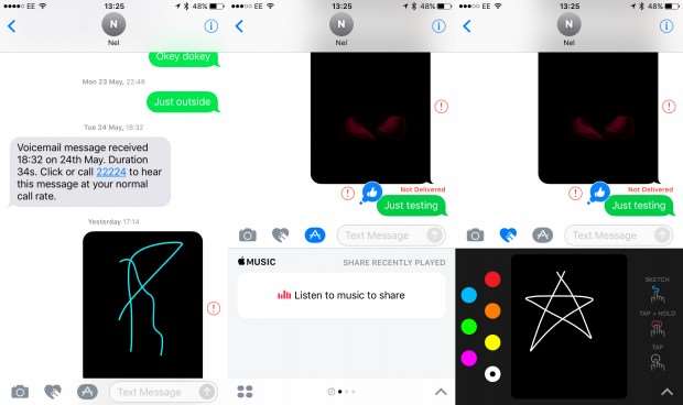
Other rather facile changes include the ability to add chat-bubble effects by changing their appearance, and add scribbles, various animated images and even full-screen effects to the chat window.
I'm a little more inspired by the ability to send quick message affirmations. For those moments when a little encouragement is needed, or you want to quickly agree, little reactions like this can be more effective than words themselves.
For developers
And, of course, there's a whole host of features aimed at third-party app developers, which will (eventually) improve the iOS experience as a whole, but will take time to fully round out.
From the ability to set a default phone app for certain contacts, to receiving VoIP calls as if they were native calls, and the ability to tap into Siri and third-party apps within iMessage, there's a huge amount in iOS 10 for app developers to digest.
App happy
The rest of the changes aren't updates to iOS per se, but upgrades to the operating system's various core apps. I've already mentioned the improvements to Mail and Messages, but there are also big changes afoot for Photos, which gets facial recognition at last.
The new People section in the Photos app shows a list of faces the app has recognised, listed by most popular. Tap one of these and you'll see a list of all the photos with that person in it, a map displaying where those photos were captured, and a list of related items at the bottom of the screen. So far, this is working very well indeed. Another, small but useful addition.

The new Memories section detects events and groups photos together in a music-backed montage, and I like what I see here too. There's nothing particularly new: Google Photos users have had a similar feature in the shape of Assistant videos and collages for some time, but it is slick in typical Apple style.
HomeKit has been replaced with the new Home and also gets a redesign, which will excite those 10 or so people who have fully kitted out their houses with HomeKit-compatible smart-home devices. Apple Maps has been given a jiggle and now has Google Now-style predictive features, enabling it to detect things like your daily commute, showing you how long it will take to get there. Maps' new dynamic view, meanwhile, will make it easier to see navigation information, zooming in and out at junctions as you drive.
Elsewhere, there are updates to Apple Music and Apple News. The former will show lyrics when you select a song, so you can sing along like crazy when you're listening to your favourite tracks on the bus – something we could all do without, I think you'll agree. There's also a new Discovery Mix option similar to Spotify's Discover Weekly playlist, among other small tweaks. The News app receives a few small interface changes, plus a new feature called “Subscriptions”. I'll leave it to you to guess what that one means.
Early verdict
In terms of what's been added in this release, I'm not at all impressed
I haven't been using iOS 10 for long enough to deliver a final verdict just yet, and of course, Apple hasn't finalised everything either. It seems reasonably stable, with the odd glitch here and there, and the homescreen search – the one you access with a quick drag down in the middle of the screen – isn't working on my iPhone 6s.
In terms of what's been added in this release, however, I'm not at all impressed with iOS 10. Apple has let down iPad users in a big way, with very few improvements, instead choosing to focus on iPhone users.
And while I understand this, and like the improvements to the lockscreen, notifications and 3D Touch, I can't help feeling they don't amount to much. Who needs a funky lockscreen when you can unlock your phone with your fingerprint in less than a second? The improvements to the core apps are likely to have more impact, but only if you use those apps instead of some third-party alternative.
Ultimately, the majority of iPhone and iPad users will install iOS 10 when it's finally released in September, but my initial impressions are that most won't be wowed by what they see. iOS 10 is a solid, worthy update, but not a stellar leap forward.


.jpg&h=142&w=230&c=1&s=1)

.jpeg&h=142&w=230&c=1&s=1)


.jpg&w=100&c=1&s=0)

.jpg&w=100&c=1&s=0)
.jpg&w=100&c=1&s=0)