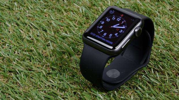
The Apple Watch has only two physical controls. The first – a plain button – simply brings up a list of your favourite contacts, allowing you to quickly call them or send them a text (there are several Watch-specific kinds of communication, which I'll come back to shortly).
The other control is much more interesting, and ends up as the heart of how you work with the Apple Watch.
The “Digital Crown” looks and feels like a normal crown used to wind up a mechanical watch or adjust the time. On the Apple Watch, you rotate it to scroll up and down lists of content on screen; press it take you back to the watch face or app homescreen; or press and hold it to invoke Siri.
The insight behind it is simple: on a small screen, if you have to use your finger to scroll through content, you obstruct the screen. Rather than using your finger to scroll (which is an option), you should use the Digital Crown instead.
If you've used a smartwatch before, this takes some getting used to. I had to spend a couple of days reminding myself not to scroll onscreen with my finger, but once I got used to the idea the Digital Crown was incredibly useful, allowing me to see and do more on the Watch.

The screen itself is a high-quality AMOLED display, and perfectly readable in sunlight. Despite wearing glasses and being old enough that I need to squint occasionally when reading things, I found it perfectly comfortable.
The resolution is 272 x 340 on the 38mm model, and 312 x 390 on the 42mm, which is to say perfectly sharp at normal viewing distances.
And, like the trackpad on the new MacBook and 13in MacBook Pro, the Apple Watch screen incorporates “Force Touch”. Tap on the screen to do one thing. Tap and press harder, and it appears as if you're pressing through the screen – a weird feeling at first, but one that you very quickly get used to.
This is used in apps to show additional options, such as dismissing all your alerts.
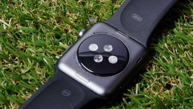
On the back of the Watch, you'll find the sensors for checking your heart rate. Heart-rate checking is, in theory, continuous. In practice, in order to save power, the Watch only checks your heart rate every few minutes unless you're explicitly exercising.
I compared the Watch's heart-rate claims by checking my pulse manually, and found they were accurate to within a handful of beats per minute.

Setting up the Apple Watch is one of those experiences only Apple could create. There's no fiddling with Bluetooth pairing. Once it starts up, the new Apple Watch shows an animation on its screen and you simply point your phone's camera at it. It then pairs for you; you never have to do anything else.
Faces and "Complications"
Creating the user interface for a tiny screen you wear on your wrist will always be a major challenge. If you want to make something that works on a small screen, there's no point in replicating what you have on a smartphone. If you do that, you'll create something that delivers a poor experience.
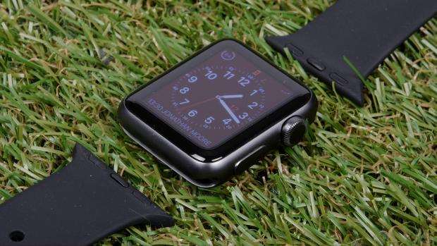
At the heart of the Apple Watch, as the name suggests, is the watch face itself – and as you might expect, Apple's design team has really done an excellent job. Every face is a thing of beauty.
There are classic utility faces, modern-looking faces, and faces that are more abstract. There's even a rendition of the classic Mickey Mouse face, complete with Mickey tapping his foot every second.
Most of the watch faces can be customised with what Apple calls "Complications". On traditional watches, a complication is anything that “complicates” the watch face, including elements such as timers, dates and so on.
On the Apple Watch, Complications are customisable, and you can choose which Complication to show in any of the available “slots” on the watch face.

Although you can change Complications (along with some other features, such as the number of numbers shown on a rotary-dial-style face and the colour of elements such as the hands), you can't create your own from scratch.
At present, you're limited to customising what Apple provides. Even developers are forbidden, at this point, from producing new watch faces.
I think there are good technical reasons for this. Looking at Apple's faces, it's apparent that one of the design goals is to maximise the amount of black on screen, and minimise the number of coloured pixels.
Because the display is an AMOLED one, where black pixels draw no power, it's safe to assume Apple's black-led face designs are primarily there to avoid power drain.
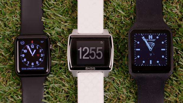
Of course, if you're coming from the free-for-all world of Android Wear, not being able to have a custom watch face that represents your personality will be frustrating, although the history of Apple (and in particular the iPhone) suggests Apple will ultimately allow more freedom to developers.
However, I think this is a sensible trade-off. Battery life is something that's clearly a very high priority for Apple, and also its customers.

Next: What about the apps?


_(25).jpg&h=142&w=230&c=1&s=1)
_(30).jpg&h=142&w=230&c=1&s=1)


.jpg&w=100&c=1&s=0)


